Scroll to explore
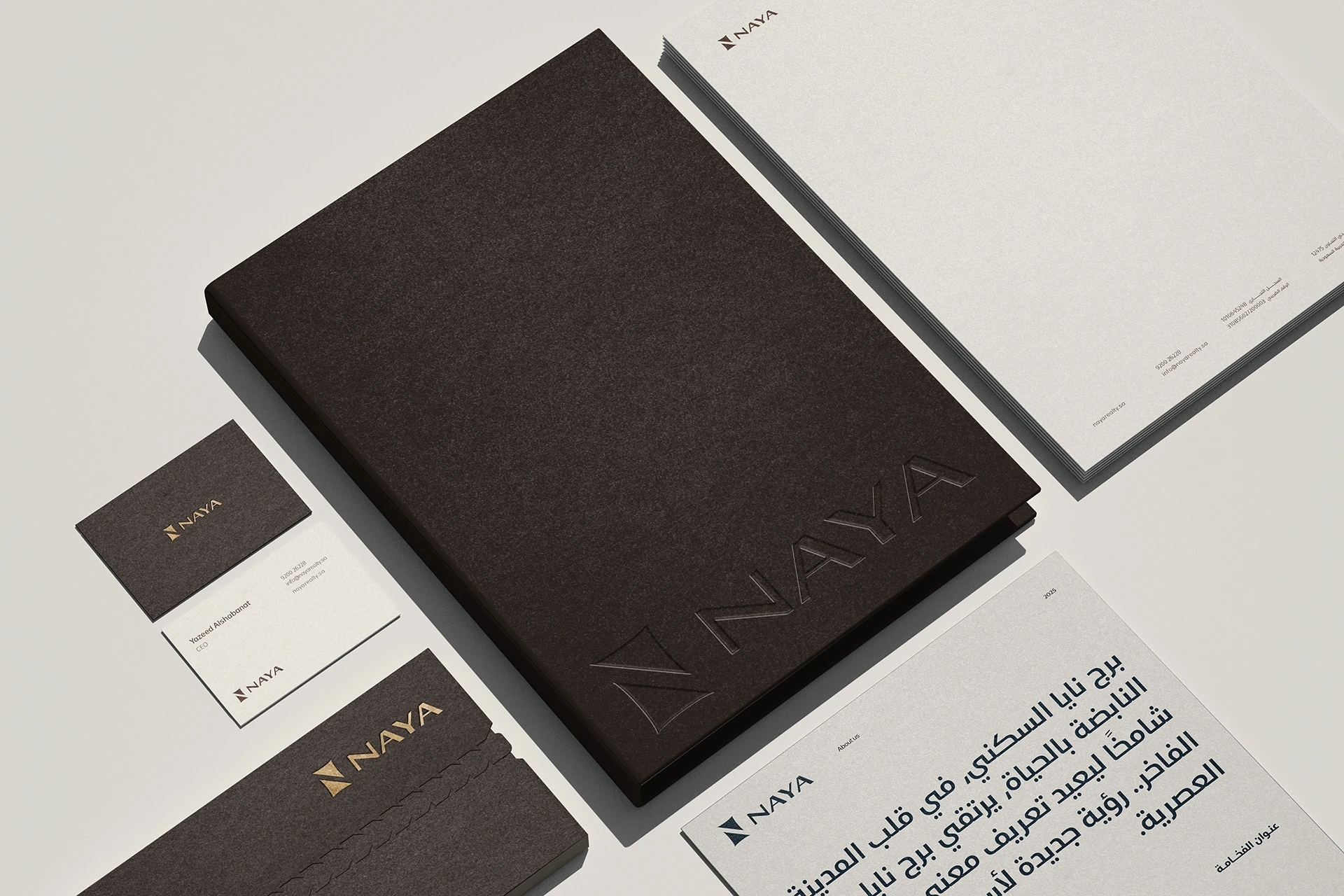
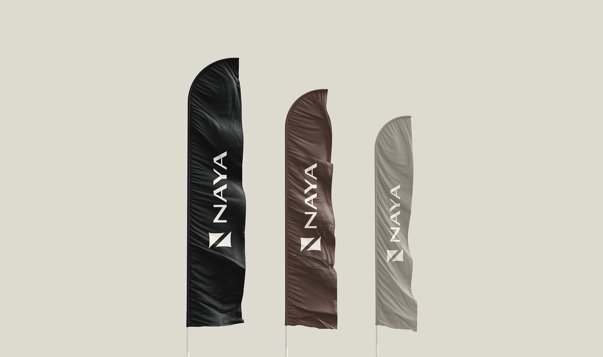
DOO® was commissioned to redefine the brand, sharpening its strategic foundation and crafting a visual system that carries the same calm precision as the architecture itself. The result is a cohesive identity, extended across every brand touchpoint, that positions NAYA as a benchmark for modern Saudi living.
Client:
NAYA Realty
Category:
Real Estate Development
Location:
Riyadh, Saudi Arabia
Year:
2025
Status:
Completed
Deliverables
Brand Strategy
Visual Identity
Brand Applications
Digital Kit
Exhibition Assets
Scope
Market Definition
Repositioning
Brand Vision
Brand Strategy
Naming & Brand Architecture
Visual Identity
Digital Presence
Marketing & Launch Planning
Go-To-Market Assets
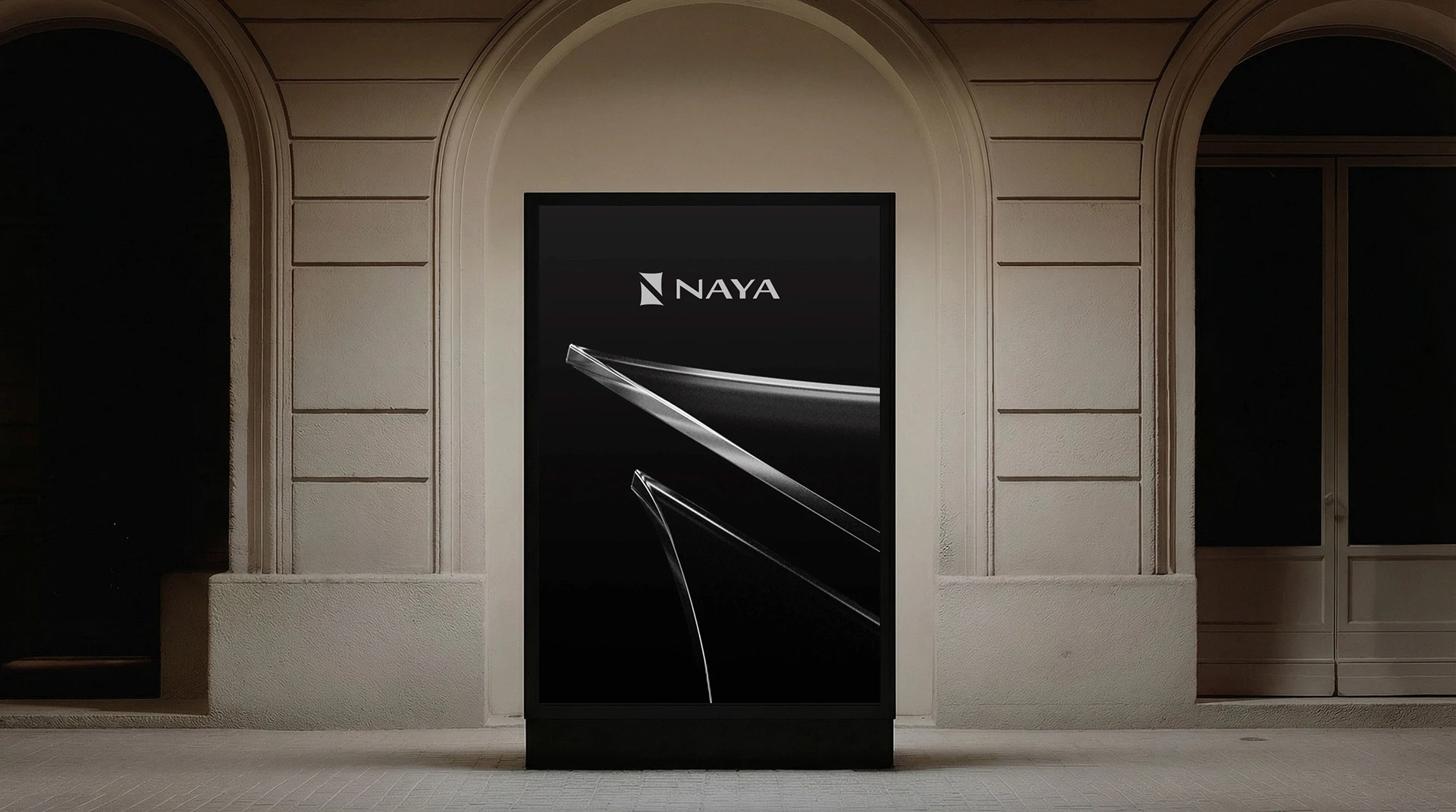
NAYA had the product, but not the brand to match it. Its previous identity felt generic and failed to convey the quality, warmth and lifestyle behind its developments. As the Saudi real estate market grew more crowded, NAYA needed a brand that could express elegance and modernity with confidence, and give buyers a clear reason to choose it.
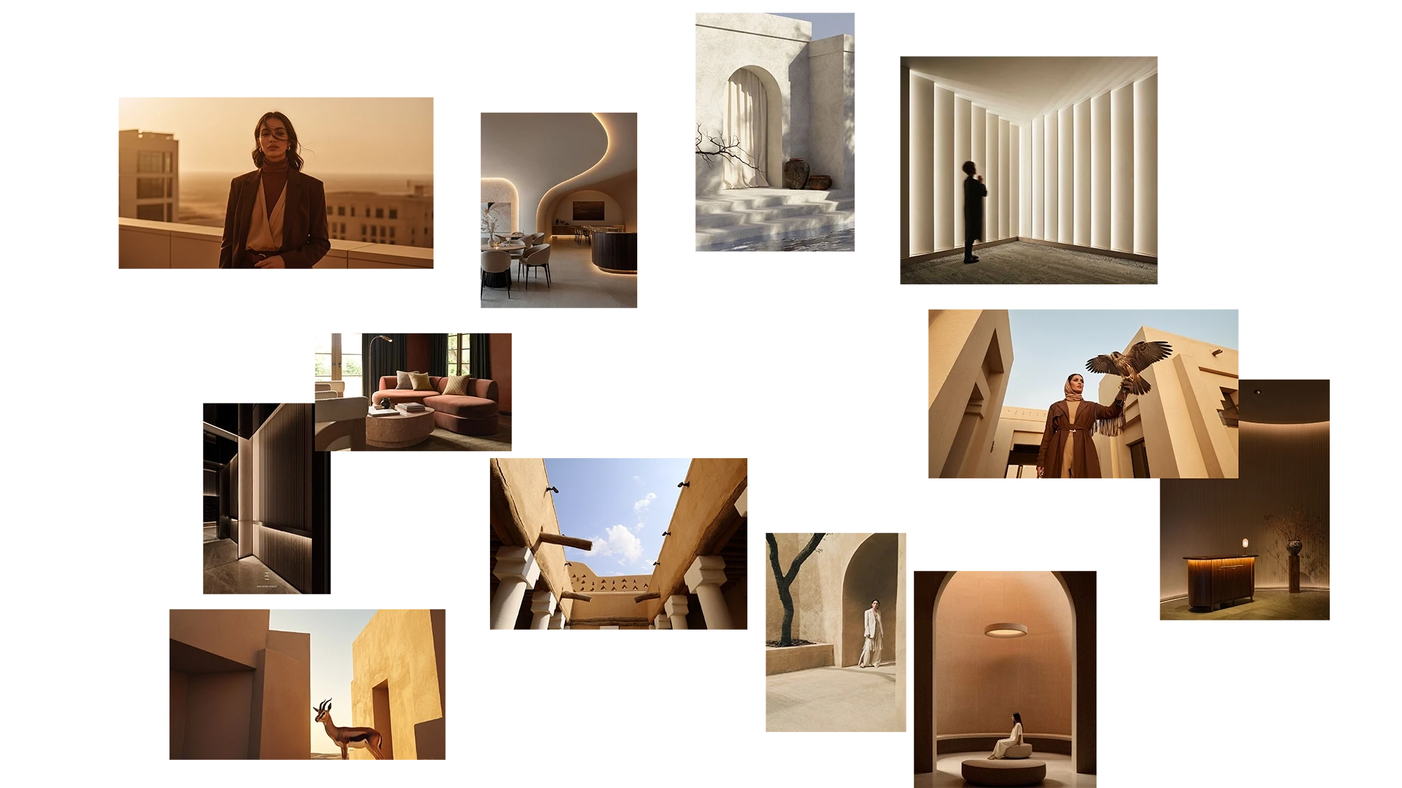
We studied the Saudi real estate market through competitor benchmarking, audience research and lifestyle trends. One insight stood out: a new generation of homeowners was looking beyond specifications, choosing homes for how they feel to live in. This led us to build the brand around three pillars: modern Saudi living, architectural calm and a sense of belonging.
We positioned NAYA as a developer of places built around how people truly want to live: calm, rooted and personal. Rather than competing on scale or specifications, the brand competes on feeling, offering a quieter, more considered alternative in the Saudi real estate market.
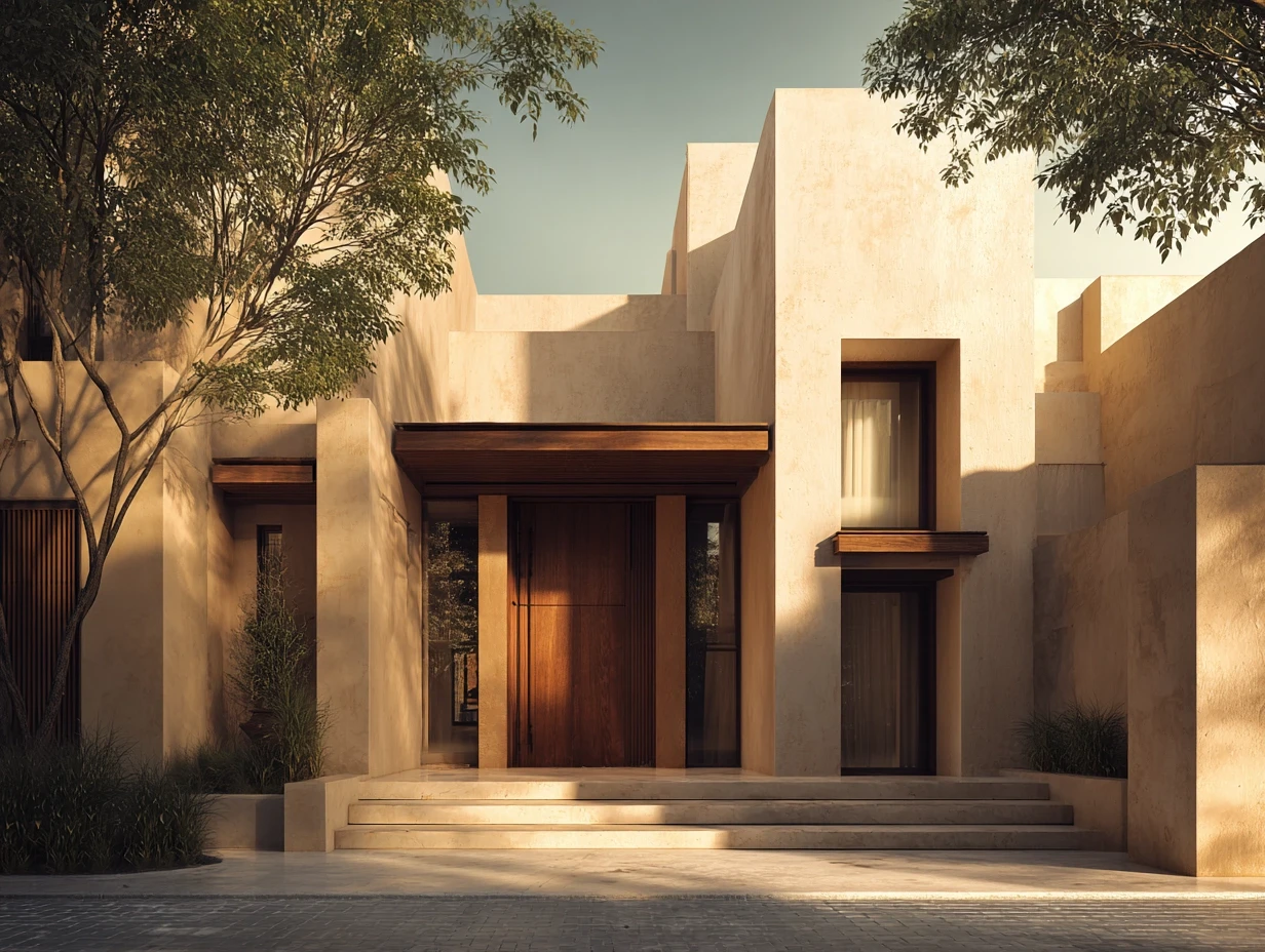
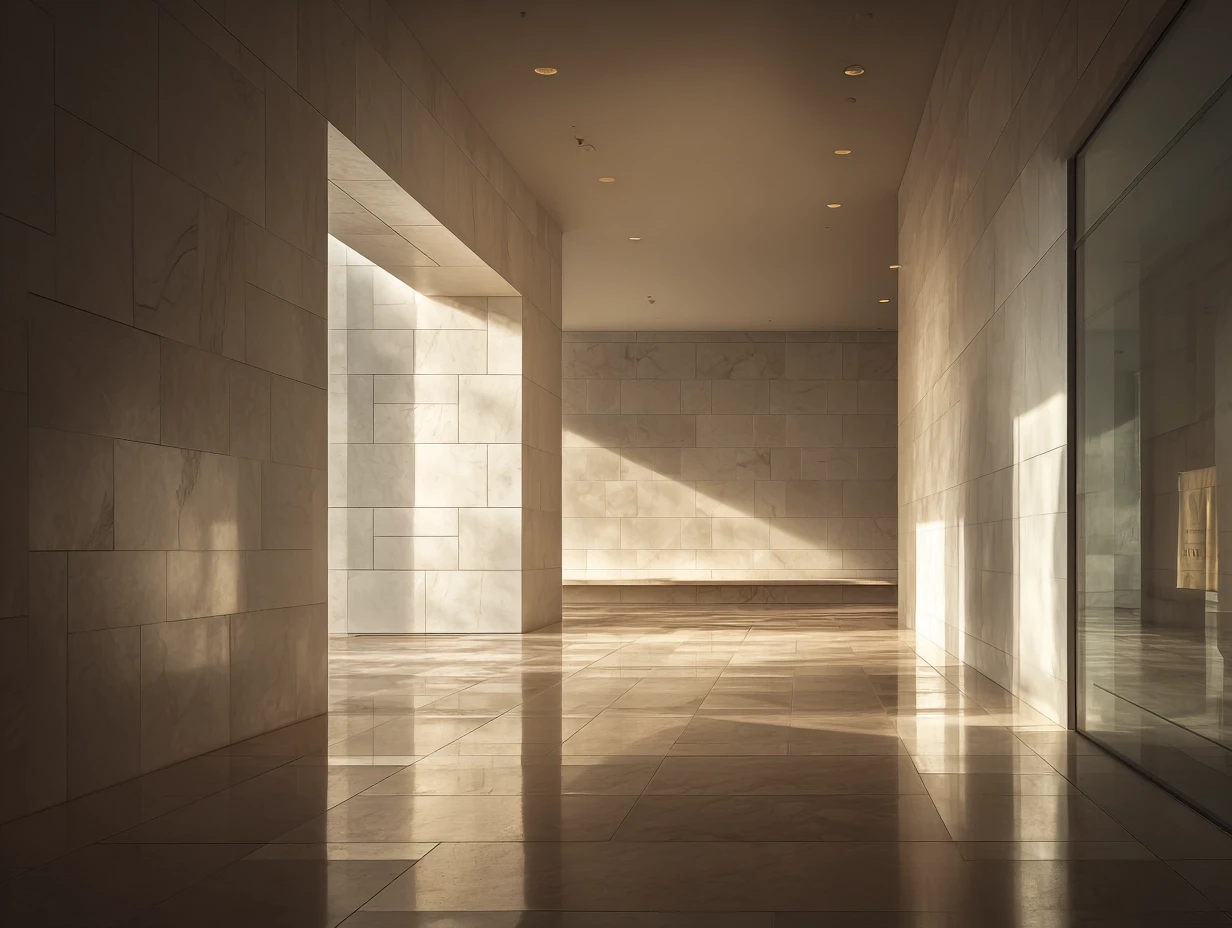
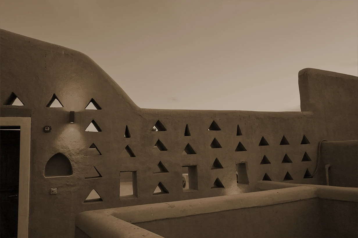
The New Address for Elevated Living
NAYA promises elevated everyday living: homes defined by quality, clarity and a lifestyle shaped with purpose. “Address” was chosen deliberately. It speaks to status and permanence, while “elevated living” keeps the focus on daily experience rather than luxury for its own sake. Together, they set a clear standard the brand must meet in every project it delivers.

The creative direction explored how modern Saudi living could be translated into a visual language that feels calm, architectural and quietly elegant.
The identity is built on the same principles as the architecture: clarity, proportion and restraint. Clean structures, a warm palette inspired by natural materials and generous, rhythmic spacing create an identity that feels composed rather than loud, rooted in place yet unmistakably contemporary.
A refined type pairing balances clarity with warmth. A clear hierarchy and generous spacing keep every message calm, confident and easy to read, from large-scale applications to the smallest detail.
A dedicated icon set drawn with the same clean lines and soft geometry as the identity. Each icon guides and informs with quiet precision, adding detail without adding noise.
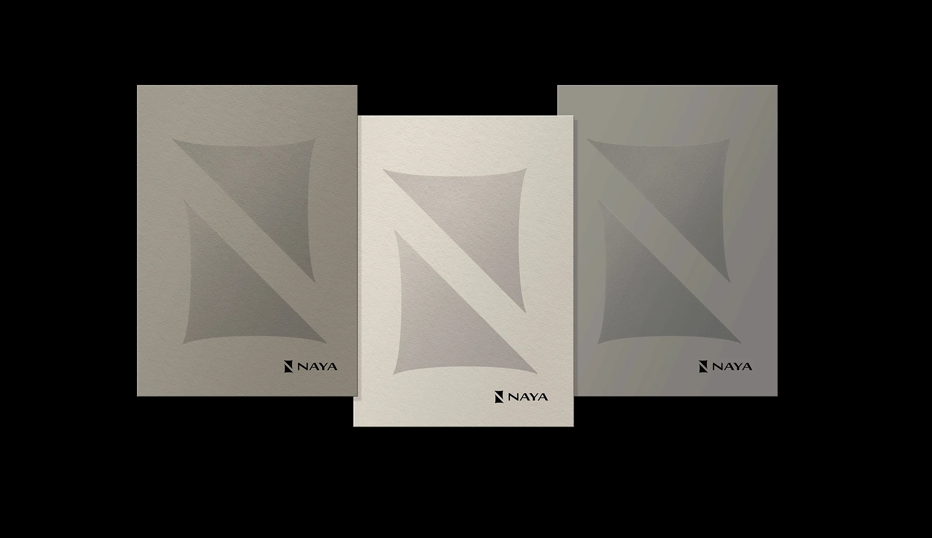
Graphic elements drawn from the brand mark and local architectural forms add texture and rhythm to the system, giving it depth while keeping it unmistakably NAYA.
A structured grid and generous white space give every layout room to breathe, mirroring the openness and order of NAYA’s spaces.
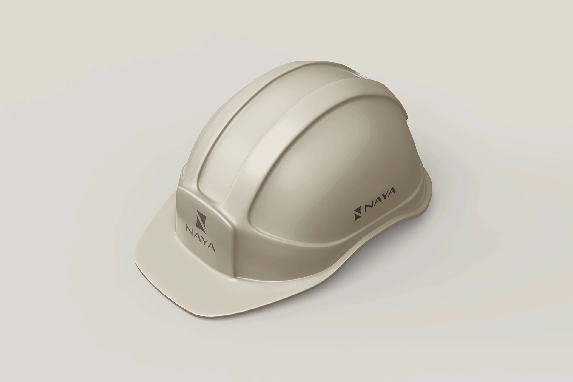
The system extends across brand applications, digital platforms and exhibition spaces, keeping every interaction with NAYA consistent, recognizable and calm.

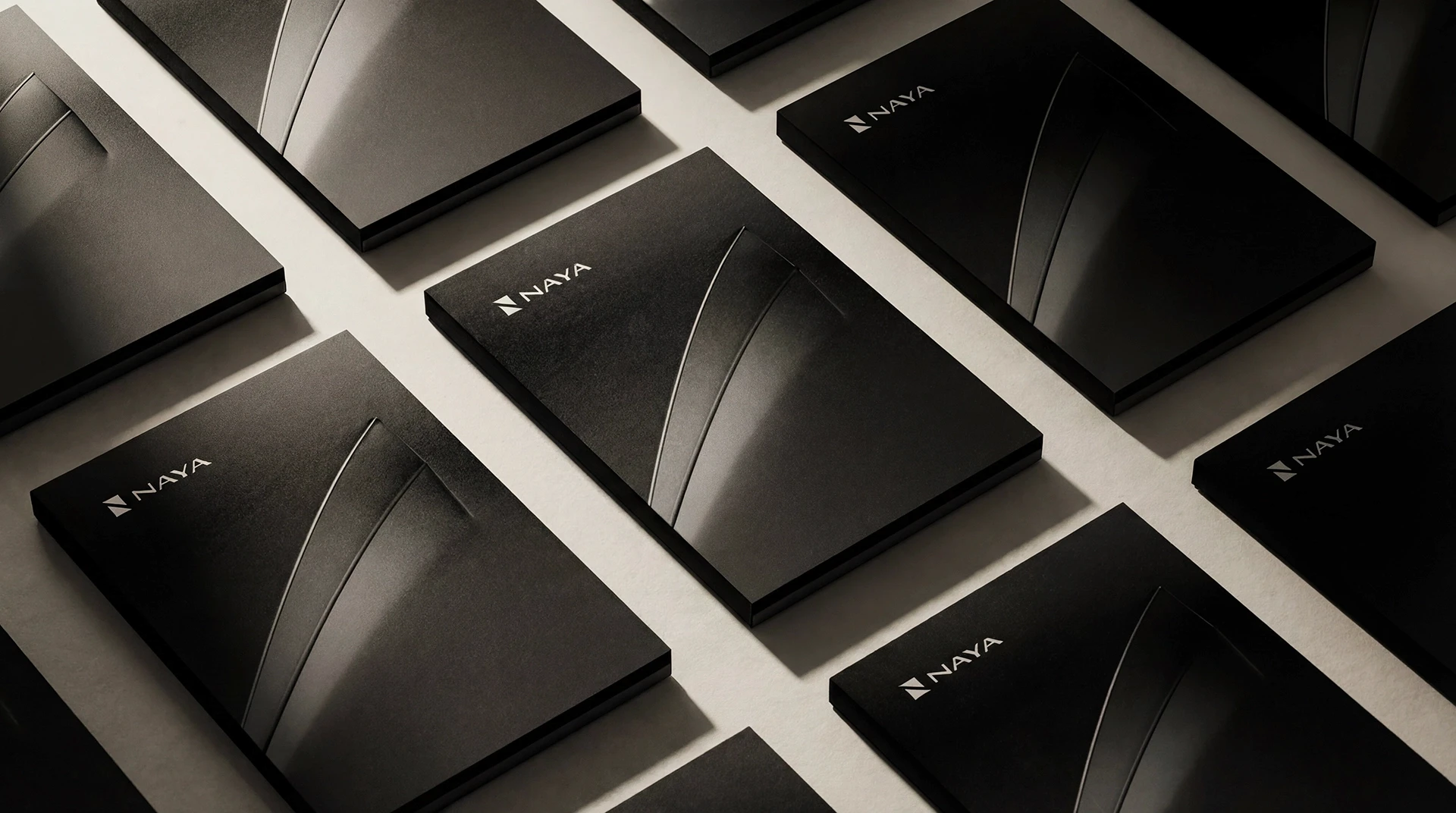
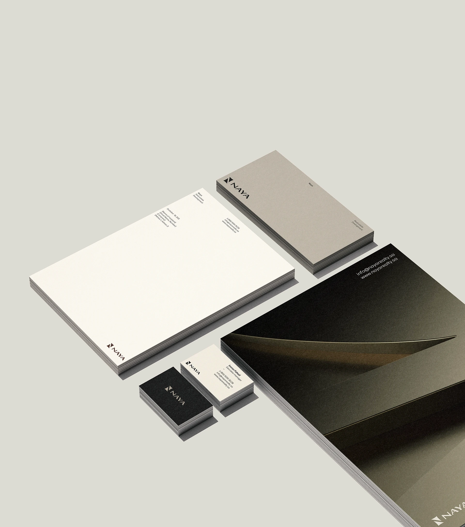
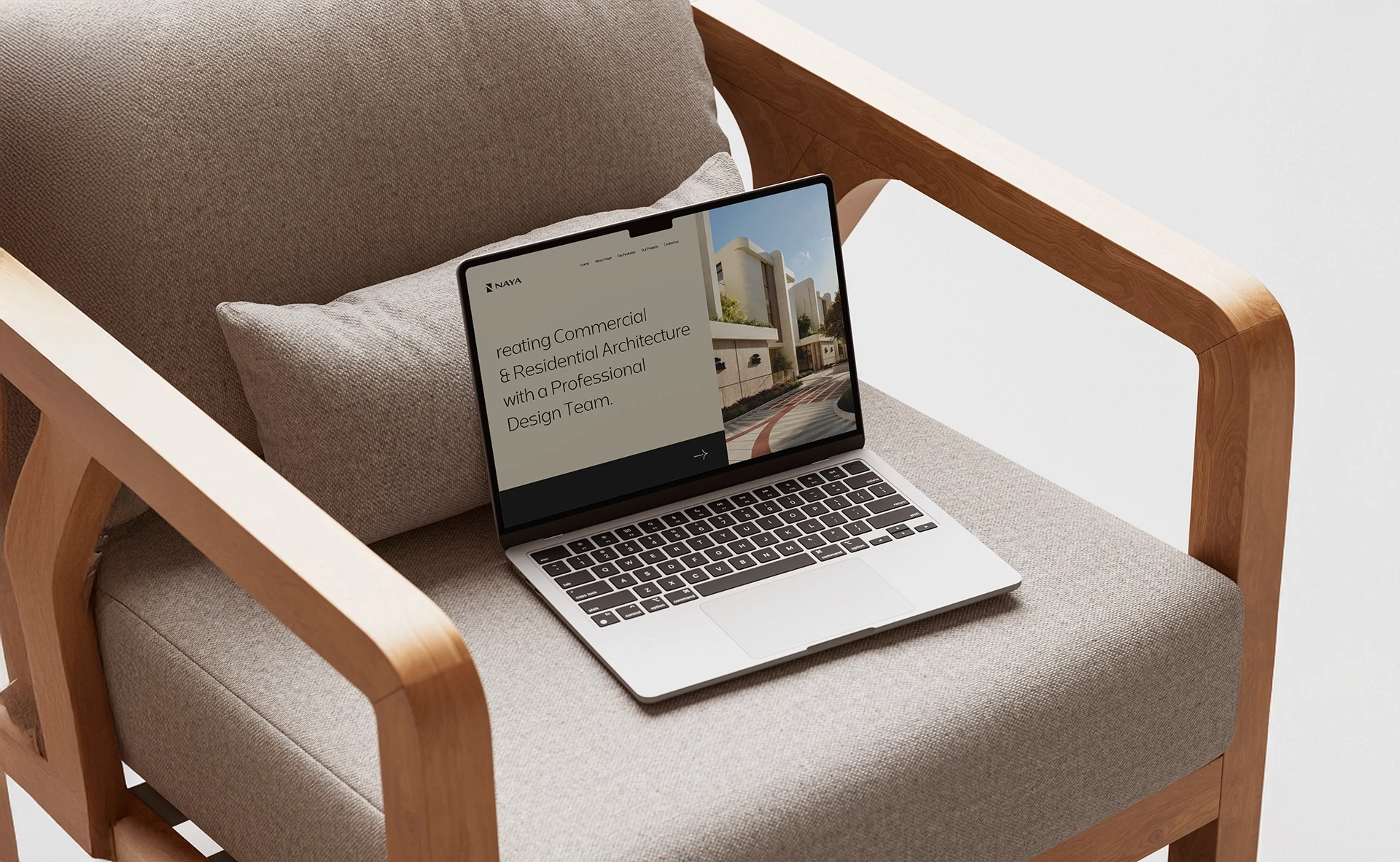
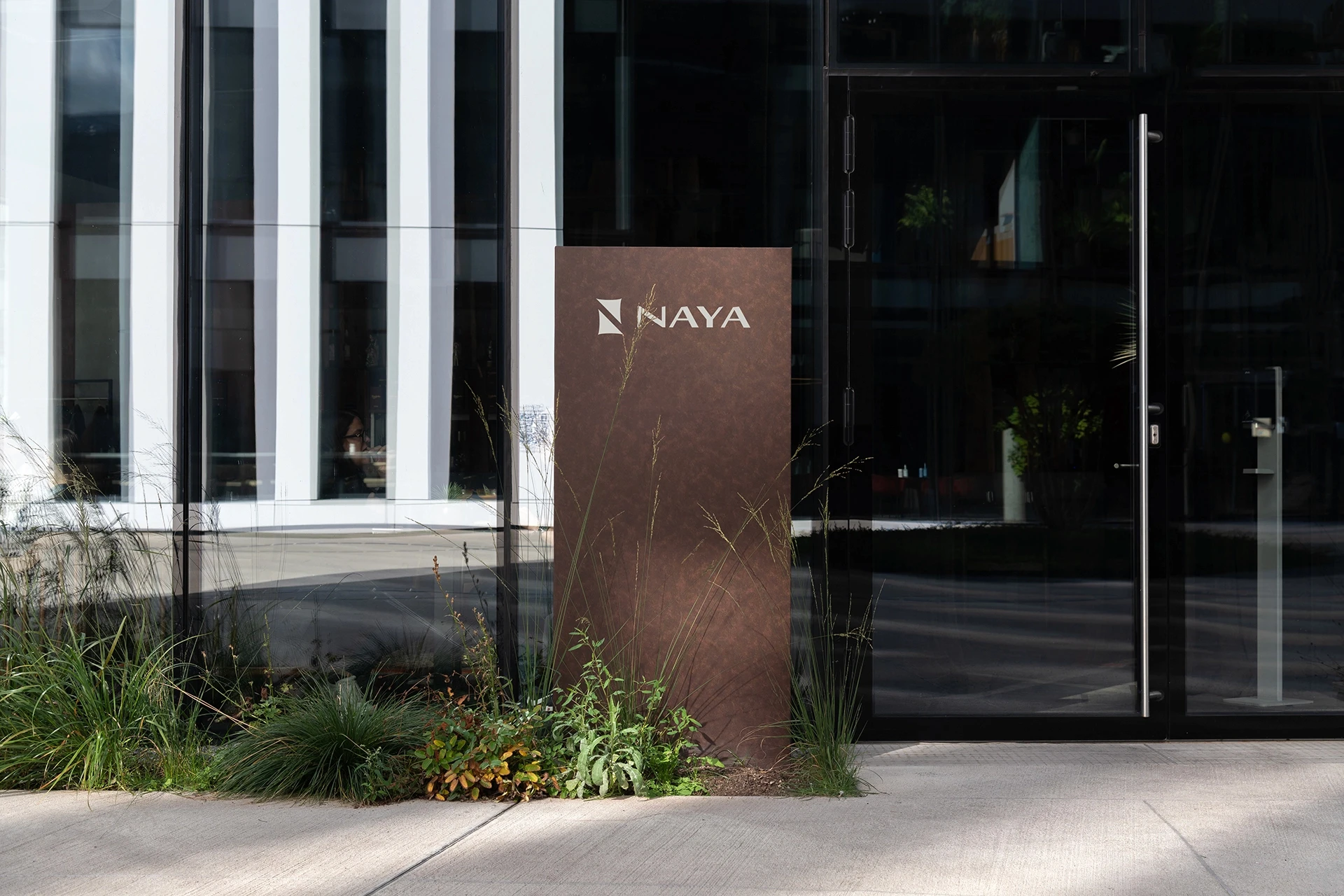
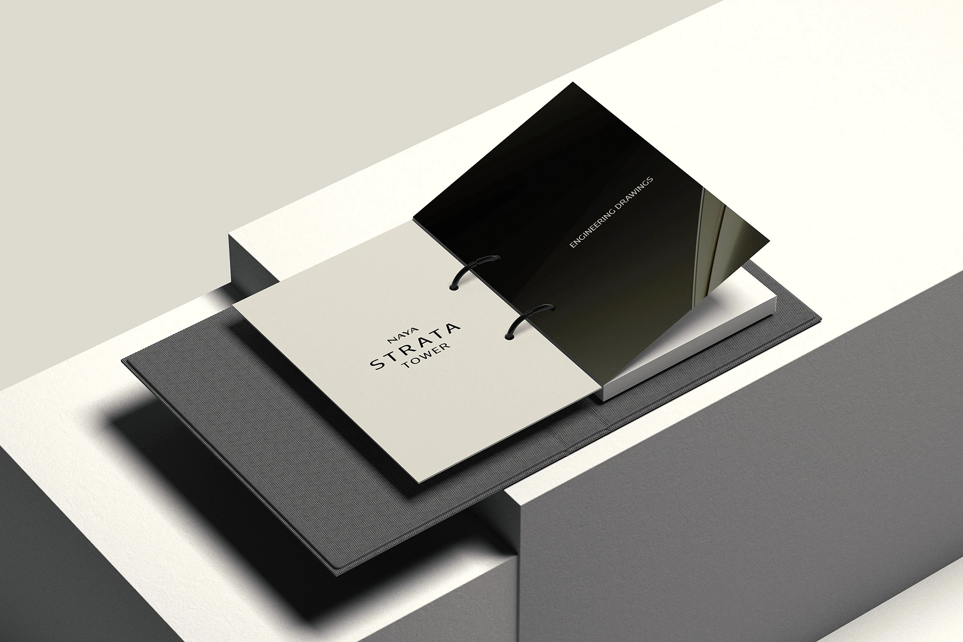
The new identity was introduced through a coordinated launch across NAYA’s digital channels, presenting the brand with confidence from the very first impression.